Showing posts tagged #DF Remote - Show all
<img src="/assets/uploads/tumblr_inline_nqcdbwjCHh1qzj0rp_1280-750x423 le viagra sur ordonnance.png" alt="tumblr_inline_nqcdbwjchh1qzj0rp_1280" width="750" height="423" class="alignnone size-full-width wp-image-668" />
Over the weekend, I implemented a lot of missing functionality, mostly related to building and buildings. Almost all buildings have their actions and options available at build time implemented now. Also improved handling of announcements, specifically popup announcements, and other UI elements. Reconnection / restoration of game state is much faster now even if the app has been terminated while in background.
I do not answer questions about the estimated release date, mostly because I do not know how much time I’ll have to work on this. Below is the list of unimplemented stuff.
Missing: military screen (while squads menu is implemented), workshop profiles, stockpile-workshop links, health overview screen, justice-related stuff, stocks screen, civilizations screen, points/routes/notes, burrows, hauling, traps/levers and their linkage, world creation/starting a new game, several building actions (e.g. assigning creatures to cages and chains), nobles requirements/demands/mandates.
It’s a huge list, and some things are really important and I will work on them now, while some are deliberately skipped and will not be done until after the first public test release. Of course, advanced players may consider all of them must-have, but technically you can play without burrows and minecarts, for example.
I’m mostly happy with the networking and UI code, so can focus on this list now. The only other non-gameplay thing I’ll do is a support for NAT traversal, so that more people will be able to connect to their game running on a computer at home.
Here are some details on feedback to user actions and on behaviour in case of network issues.
The problem. There are basically three types of actions. Some you want to perform/queue quickly, e.g. marking many items for sale. You still want some feedback, but it shouldn’t prevent you from performing further actions. Some, on the other hand, should block the UI until they are executed and response received, e.g. actually selling items. Also, map-related actions do not require any feedback - when you change z-level you naturally wait for the screen to update.
I wanted the user experience to be smooth in case of possible frequent disconnections, either because of network problems, or because of switching to other apps, locking the phone, etc. So the reconnection must be quick and shouldn’t involve reloading more of the game state than required. At the same time, the game state must be always synchronised between the server and the app - if you issued a command to sell items, then disconnected and reconnected, you should see the result, and the command must not be sent/executed again.
The solution. The app and the server now maintain a queue of undelivered commands and responses that is preserved between connections to the same game. This means that no use action can ever fail because of a network problem - the app will try to reconnect until it succeeds and sends/receives all queued commands and responses, or until you cancel. You do not need to retry any actions manually. Implementation of game screens became easier too, there’s no need for any screen-specific actions to handle network problems and/or to synchronise the state after reconnection.
The video at the top shows how it all works from the user’s point of view. Timeouts are deliberately inserted in the server code, and also the same command was used to demonstrate both non-blocking and blocking behaviour. There’s a small set of commands that are transmitted separately and not handled by this mechanism, mostly related to map movement and updates.
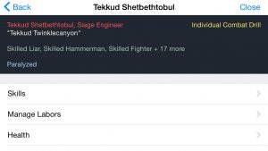
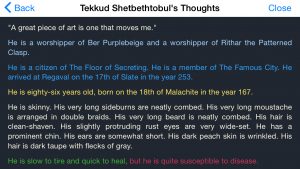
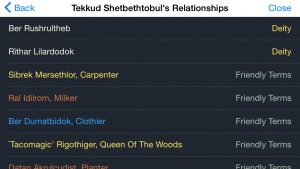
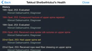
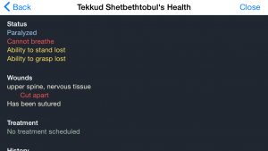
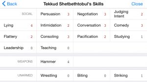
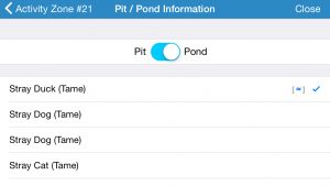
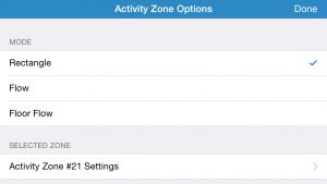
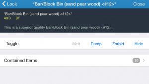
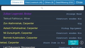
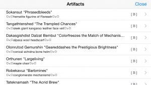
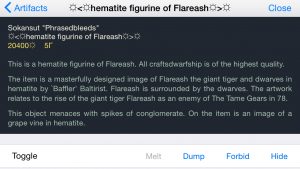
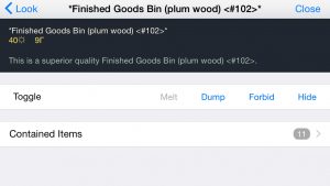
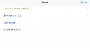
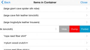
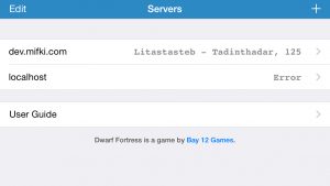
Finished with the unit-related screens. Next is.. what was next.. server connection screens, look command and item info, and military.
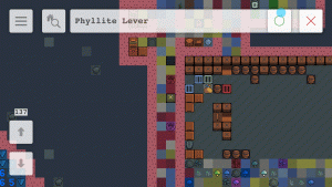
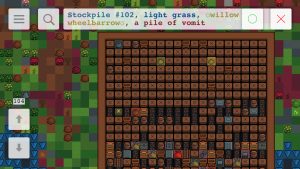
Also experimenting with colours. Dark background allows to use DF colour schemes as is. But dark background in lists doesn’t look good with all the standard light UI, so everything needs to be made dark – something I wasn’t going to do.
