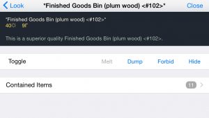
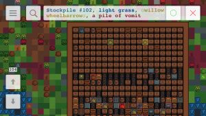
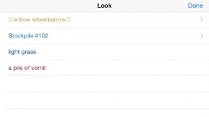
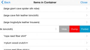
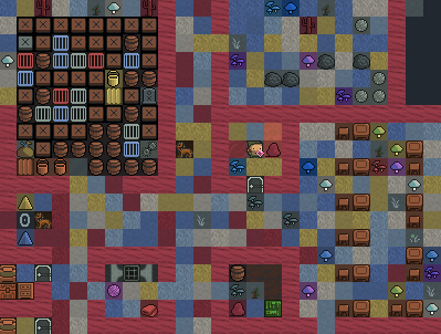
df.global.world.raws.language.colors[value-100]. One example of how to use this is the included script realcolors.lua, which processes material definitions and replaces tile colours with values from material.state_color.Solid, which will give results similar to the screenshots below.
Before:
 After (note the different colours of wooden furniture):
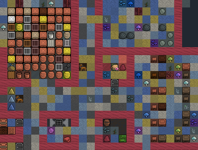 Technically this was very easy to do but some work probably will be required from tileset authors. Some colours specified in vanilla raws are not quite correct, but this can be fixed (e.g. by using an external colour database, one option is to use Stonesense data, as Japa suggested).
The biggest problem here is that tilesets are designed to make use of background and foreground colours, while if we make use of colour tokens, there will be only one foreground colour. For the background colour, we’ll have to either leave it as is, or set to some fixed value (e.g. black or white), and that’s not what existing tilesets expect.
EDIT: On the other hand, if you specify colours manually (in raws or overrides.txt for overrides), you can still have both foreground and background colours set to anything you want.
Here are some details on feedback to user actions and on behaviour in case of network issues.
The problem. There are basically three types of actions. Some you want to perform/queue quickly, e.g. marking many items for sale. You still want some feedback, but it shouldn’t prevent you from performing further actions. Some, on the other hand, should block the UI until they are executed and response received, e.g. actually selling items. Also, map-related actions do not require any feedback - when you change z-level you naturally wait for the screen to update.
I wanted the user experience to be smooth in case of possible frequent disconnections, either because of network problems, or because of switching to other apps, locking the phone, etc. So the reconnection must be quick and shouldn’t involve reloading more of the game state than required. At the same time, the game state must be always synchronised between the server and the app - if you issued a command to sell items, then disconnected and reconnected, you should see the result, and the command must not be sent/executed again.
The solution. The app and the server now maintain a queue of undelivered commands and responses that is preserved between connections to the same game. This means that no use action can ever fail because of a network problem - the app will try to reconnect until it succeeds and sends/receives all queued commands and responses, or until you cancel. You do not need to retry any actions manually. Implementation of game screens became easier too, there’s no need for any screen-specific actions to handle network problems and/or to synchronise the state after reconnection.
The video at the top shows how it all works from the user’s point of view. Timeouts are deliberately inserted in the server code, and also the same command was used to demonstrate both non-blocking and blocking behaviour. There’s a small set of commands that are transmitted separately and not handled by this mechanism, mostly related to map movement and updates.
