Showing posts tagged #iOS - Show all

June 9, 2015
Spent last couple days playing Dwarf Fortress on the go (too bad there’s no save button yet). This resulted in fixing some crashes, making UI/UX improvements related to repeating operations like placing buildings, and also dramatically improving network performance and responsiveness. Here’s a video demonstrating gameplay over a 3G cellular connection to a server in another country (175ms ping). Actually, it’s a bit smoother in real life then on a recording.

I’m now finishing this stuff, then will be another round of implementing missing screens and functionality, and then I’ll prepare an alpha version to give out to number of people to try.
·

Experimenting with UI colours again

June 5, 2015
Dark background is required to be able to use standard DF colours for professions, jobs, materials and everything else, but initially I was going to use all the default colours for UI components. Probably only some screens will be dark, and some will be partly dark, as the item and unit info screens.

Also making row height smaller on certain screens either as an optional compact mode, or more likely not optional, because it’s much less comfortable to navigate long lists (units, trade goods) when only several items fit on screen, compared to one text line per item in DF on desktop.
·
June 5, 2015
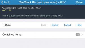
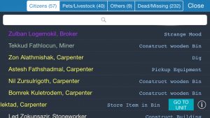
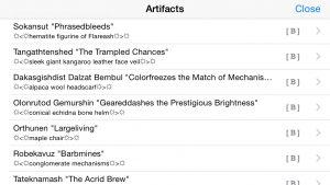
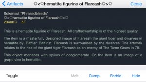
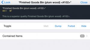
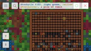
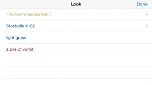
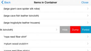
Artifact list, item info screen, look mode, look list, container contents view. Look mode eventually will replace building query mode and unit selection modes because there’s no sidebar on mobile so no real differences between them anyway.
·
May 2, 2015

Here are some details on feedback to user actions and on behaviour in case of network issues.

The problem. There are basically three types of actions. Some you want to perform/queue quickly, e.g. marking many items for sale. You still want some feedback, but it shouldn’t prevent you from performing further actions. Some, on the other hand, should block the UI until they are executed and response received, e.g. actually selling items. Also, map-related actions do not require any feedback - when you change z-level you naturally wait for the screen to update.

I wanted the user experience to be smooth in case of possible frequent disconnections, either because of network problems, or because of switching to other apps, locking the phone, etc. So the reconnection must be quick and shouldn’t involve reloading more of the game state than required. At the same time, the game state must be always synchronised between the server and the app - if you issued a command to sell items, then disconnected and reconnected, you should see the result, and the command must not be sent/executed again.

The solution. The app and the server now maintain a queue of undelivered commands and responses that is preserved between connections to the same game. This means that no use action can ever fail because of a network problem - the app will try to reconnect until it succeeds and sends/receives all queued commands and responses, or until you cancel. You do not need to retry any actions manually. Implementation of game screens became easier too, there’s no need for any screen-specific actions to handle network problems and/or to synchronise the state after reconnection.

The video at the top shows how it all works from the user’s point of view. Timeouts are deliberately inserted in the server code, and also the same command was used to demonstrate both non-blocking and blocking behaviour. There’s a small set of commands that are transmitted separately and not handled by this mechanism, mostly related to map movement and updates.

·

Status update

April 7, 2015
Long time no updates, been busy with other things lately. Now finishing server management, game loading and all related screens. Also experimenting with and polishing networking code - spent some time playing on remote servers via real network connections (as opposite to all on local machine). With reasonable networks connection and server location (i.e. not on the other end of the world) everything seems to be playable fine.
·

Dwarf Fortress on iPad

March 28, 2015
Dwarf Fortress Remote on iPad is terrific. Many parts of the UI will need to be reworked though - more cool things are possible on a bigger screen and some existing elements are less comfortable. But iPhone is still the main focus - its UI will work on iPad even if suboptimal, but not the other way round.
·

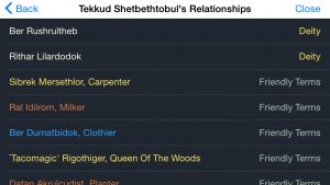
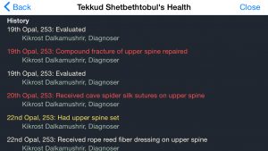
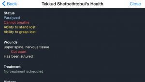
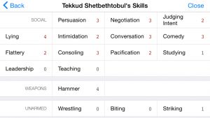
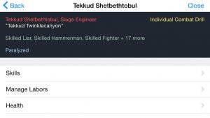
Finished with the unit-related screen

March 10, 2015

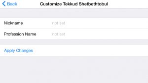
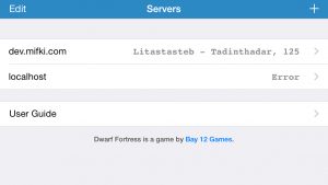
Finished with the unit-related screens. Next is.. what was next.. server connection screens, look command and item info, and military.

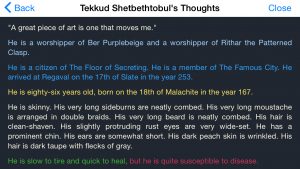
Also experimenting with colours. Dark background allows to use DF colour schemes as is. But dark background in lists doesn’t look good with all the standard light UI, so everything needs to be made dark – something I wasn’t going to do.
·
March 1, 2015
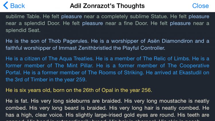
Proper spacing between paragraphs improves legibility much compared to the original game screen.
·

Status update

February 20, 2015
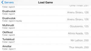
And now to unit information screens, then game loading/saving, proper UI for connecting to servers, and finally, military screen. There will still be number of missing things (including world generation by the way), but at least it should be playable after that.

Also I need to update the server for DF 0.40.24, I’m still using 0.40.12 from the time I started the project.
·